What is Retrofuturism in Interior Design?
Have you ever wondered why, with some obvious technological exceptions, the present day looks a lot like people in the early and mid-20th Century imagined it would? Well, that’s thanks to retrofuturism in architecture and interior design.
How do you define retrofuturism?
Simply put, retrofuturism is a contemporary creative movement that’s shaped by the way people in the past depicted the future.
Futurism was a movement obsessed with anticipating what the world would look like in years to come. It had a strong technological bent and was closely affiliated with science, exploring ideas about how technology would both alienate and empower people in the future. It explored ideas around efficiency, travel and industry. Futurism looked ahead to a world that had not yet happened and imagined how the world would function (and appear) as a result of technological, philosophical and material advancements.
The retrofuturists, by comparison, look back upon the futurist movement as the source of their inspiration. And retrofuturism is characterised by a blend of retro style with nevertheless futuristic technology or materials. In this sense, retrofuturism is what we would call a postmodern style, because it is an imitation of a future that never actually existed; a copy without an original, or what philosopher Jean Baudrillard would identify in 1981 as a simulacrum.
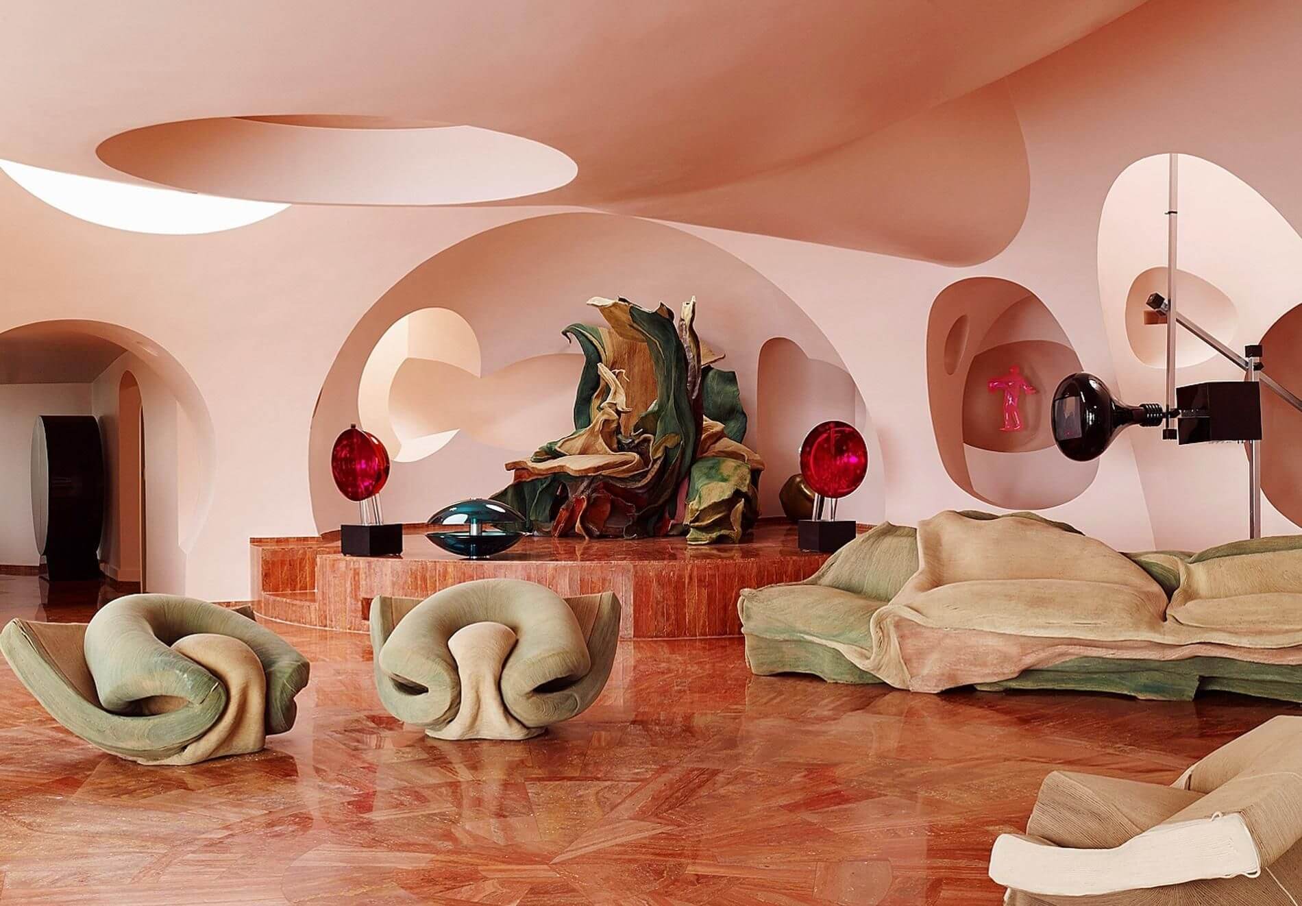
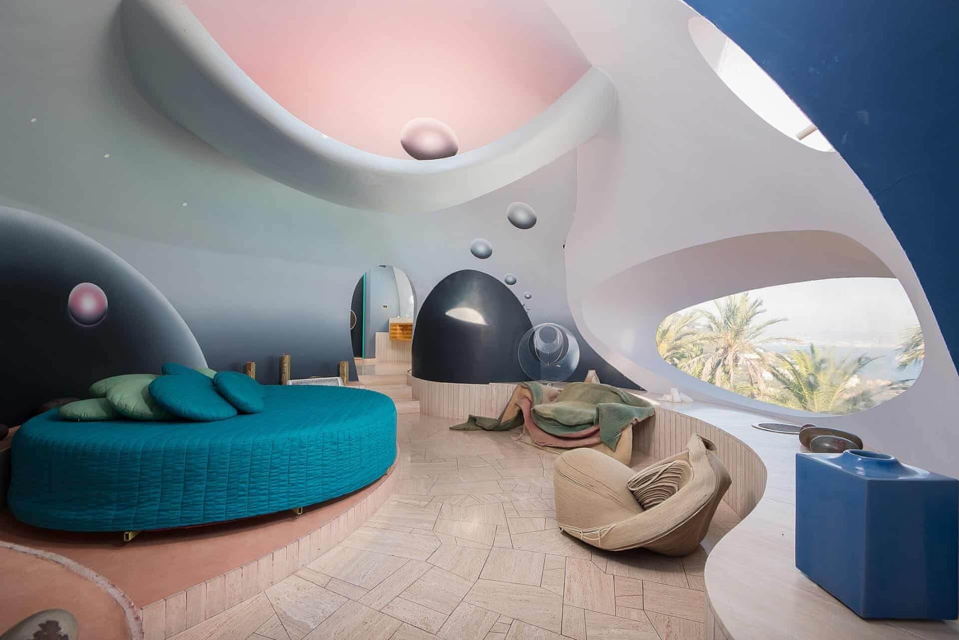
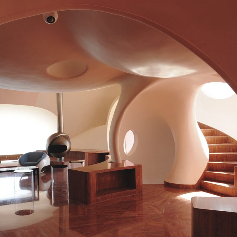
Le Palais Bulles by Pierre Cardin
Space age design
In the mid-20th Century, global culture was in thrall to the space age: obsessed with space exploration, space technology and the space race between the USSR and the USA. In around 1957, with the advent of the Soviet Union’s Sputnik 1 satellite – the first ever artificial satellite launched into space – the design world began to draw from the materials, shapes and technologies used in space engineering in developing the stuff of everyday life here on earth. From bathroom cabinets without handles to television sets that looked like satellites, these futurist designers re-imagined our world, driving it toward the futures they imagined.
As years went by and the future became real, certain elements of our world turned out to be as the futurists had imagined (such as high-speed transport), while other elements evolved much more slowly (we’re not all driving flying cars yet) or in different ways than imagined (our robots are in the shapes of cash registers and vacuum cleaners, mainly, not people). By the 1980s, mid-century space age design seemed almost embarrassing from an interior design perspective – a corny take on a future that looked somewhat ridiculous compared to what the world was really like. But not everyone felt that way.
To a growing number of designers, there was an almost geeky charm in the space age styling of the past. An ironic take on the antique collector’s mentality that saw charm in the inherent wrongness of certain elements of futurism. In the future, for instance, TVs would not look like floating orbs, but would be flat screened and almost cinematic in their size. But wasn’t that a shame? And wouldn’t there be some value in designing a contemporary television that incorporated modern technology but looked like those old designs?
As time went on, retrofuturism gripped our culture and became more embedded in it. It moved beyond its geeky-cool status to simply enter the realm of mainstream cool. Nowadays, for instance, we wouldn’t bat an eyelid at a bathtub that looks like it might belong on a 1960s sci-fi space station, but which is made from a genuinely ground-breaking material like solid surface. Because retrofuturism tells us in no uncertain terms that the past was cool because it was so imaginative. And retrofuturist interior designers pay homage to that imagination by making it a reality.
This is what we might call retrofuturism proper and it is very nostalgic, representing as it does an image of a future that might have been but never actually was.
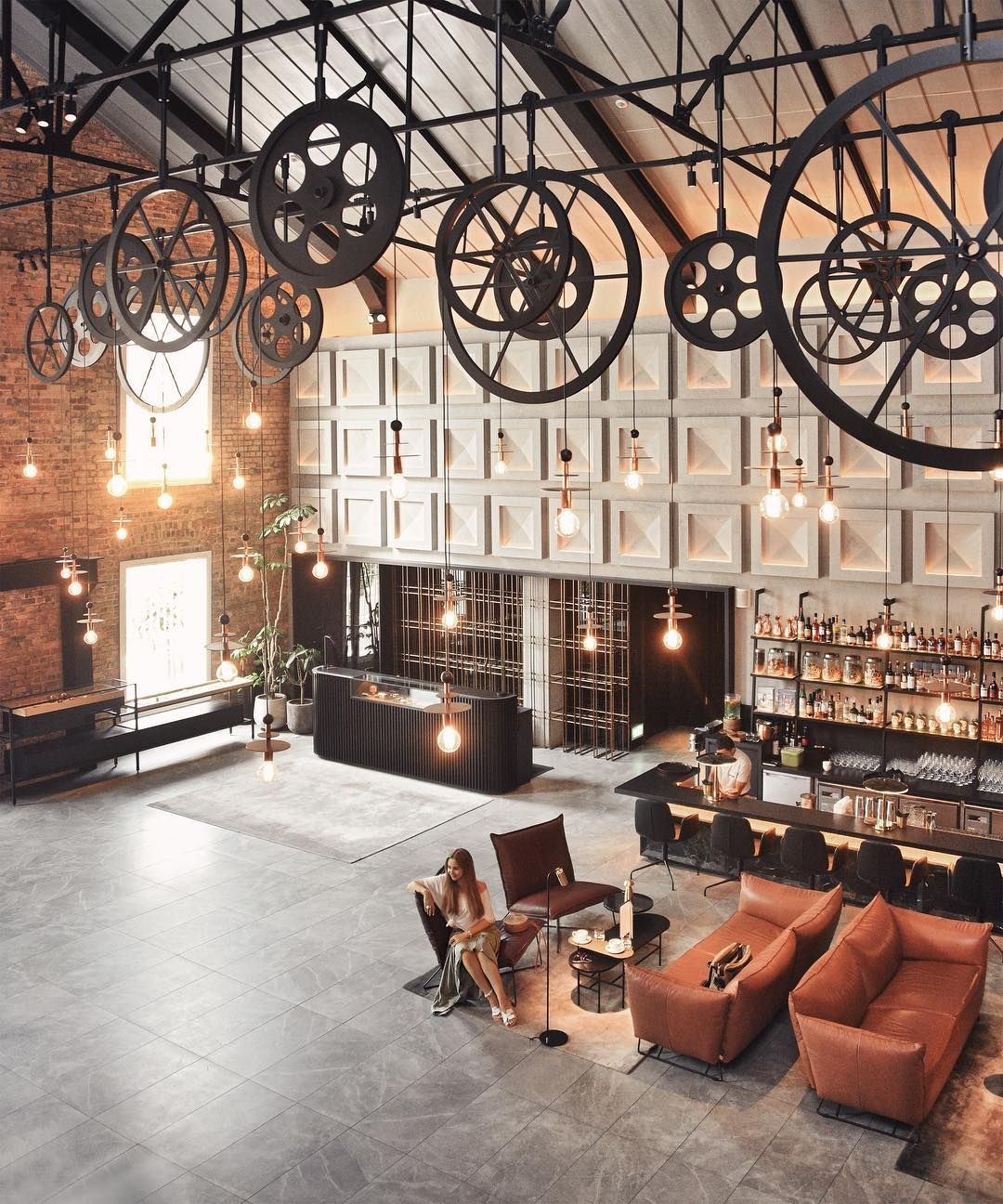
The Warehouse Hotel - Singapore
The past as seen from the future
In the past 30 years, another kind of retrofuturism has manifested itself within the design world and it is the inverse of retrofuturism proper.
Rather than looking at the future as it was imagined in the past, this second kind of retrofuturism looks at the past through the lens of the actual future as it came to be. It is inspired by the retro appeal of art, design, clothing and other cultural elements of the past but simultaneously driven to force futuristic technologies onto those periods in time.
The result is a mishmash of past, present and future that confuses history and forces a sense of timelessness on our understanding of the world. The best-known example of this design style is probably steampunk, a hyperreal re-imagining of Victorian interior design, fashion and art that obsesses over the aesthetics of the industrial revolution, all the while imbuing them with modern day technological capabilities.
The popularity of steampunk gave rise to new genres of retrofuturism, each of which looked back to different periods in history, infusing them with the same modern day technological advancements. Nowadays, the period between WWI and WWII is represented in retrofuturism by the Dieselpunk movement, while the 1920s to the 1950s (the art deco period) are represented by the Decopunk movement. Finally, we flip all the way back around to an analogue of retrofuturism proper with what’s now known as atompunk, which looks back to mid-century modern design and forces upon it the technological advancements of the contemporary era.
Confused? That’s kind of the idea. Retrofuturism thrives on the idea of bending time from an aesthetic perspective, so that period features lose their sense of datedness. In the retrofuturist world, nothing goes out of date as such; it simply lends itself to a reimagined, futuristic version of itself. Yet this doesn’t necessarily mean that anything goes.
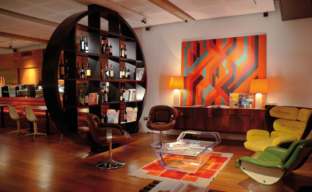
Rigidly mixing and matching periods
One interesting facet of this second type of retrofuturism is its somewhat ironic rigidity. Whilst flexible by nature, in the sense that it re-imagines old-fashioned designs to the point that they no longer look anything like what may have existed back in the time that inspired them, this type of retrofuturism is very much bound by the period to which it looks back.
Never do steampunk and atompunk meet, in other words. To do steampunk properly, there must be no sign of anything that sits noticeably in between the Victorian era and the future. To do atompunk properly, there must be no sign of any visual element designed before the 50s.
But who knows how retrofuturism will develop as a movement? The future is, after all, endlessly unfurling.
As our seemingly infinite obsession with the interior design of the past continues, we might naturally conclude that retrofuturism will become more and more reflective. So that, in the future, movements that already clash elements of past and future, such as boho (which also clashes geographical elements), will start to be imbued with those hyperreal technological aspects that characterise this second type of retrofuturism?
Did we just predict the bohopunk movement? We think we did.
Want something else to read? Check out our article on shabby chic interior design.