It’s a Material World According to Scott & Scott Architects
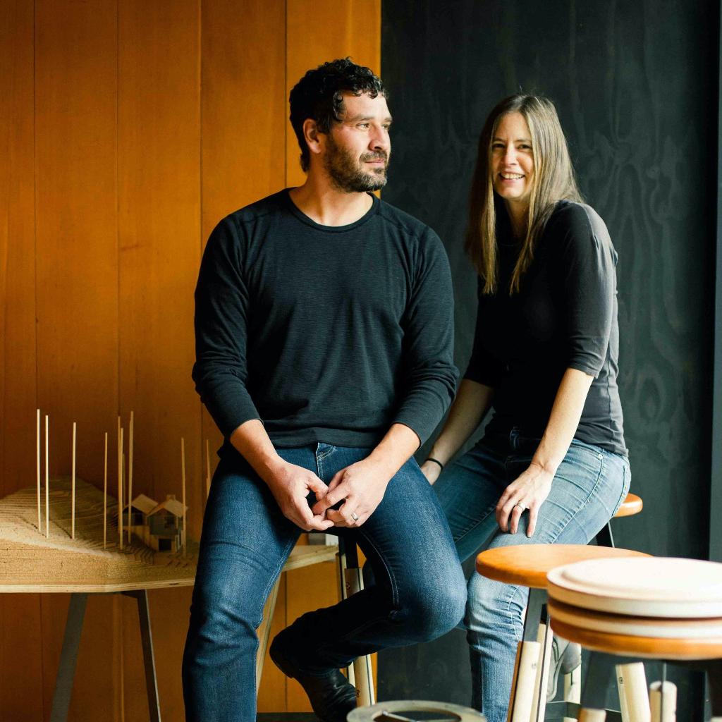
Led by husband and wife team, David and Susan Scott, British Columbia architecture firm Scott & Scott create buildings that inspire the imagination. Their downtown Vancouver ice cream shop design immerses the visitor in a world of billows and swirls that recall the building’s industrial past as much as they do its playful present and yet all with a rather lofty sense that having fun with buildings is a serious business.
That seriousness comes from a commitment to putting materials at the very core of their work. The couple met in Nova Scotia while studying at Dalhousie’s School of Architecture and after graduating, quickly developed a taste for working with salvaged materials and a compelling sense of restraint that allows material to be the hero. Even, as Nick Mitchell discovered when he spoke to David Scott, at the expense of any flights of semantic fancy.
Working in Vancouver must be incredibly inspiring. The landscape offers so much potential in terms of its connectivity between ruralism and industrialism. You can literally walk right out of the skyscrapers of the bustling downtown and into the wilds of the forested Stanley Park. There’s the maritime vibe of Granville Island; the Mid-Century low-rises of Mount Pleasant; the mountain adventurism of Grouse Mountain... Do you feel that living there has opened you up as Architects?
As students we worked for a year in London at the turn of the millennium and although it was a wonderful experience in a city which we both love; there was something unfamiliar to us about an environment where the visual high marks were architecture and with no mountains to orient oneself.
Flying back to Canada and landing in Vancouver it became quite clear how important it is for us to feel a sense of smallness up against the scale of a dominant landscape feature like the north shore mountains. It may simply be something comfortable from our own childhood; however, there is something grounding about living with the largeness of a strong natural feature which gives significance to small work. There is a humility that comes with knowing that nothing we make will be as significant as these mountains.
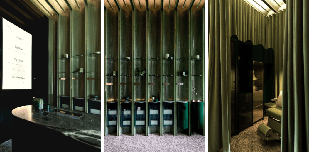
Your Fig facial bar project is a triumph of self-contradiction. The scalloped, green wooden walls – complemented by heavy velvet curtains in the same green – are warmly clinical; elaborately understated; inspired by nature and industrial design in equal measure. A kind of woodland metaphor in Mid-Century styling. How hard is it to look cool when you’re trying to put yourself across as warm? (Or vice versa?)
Spaces for personal care are often faced with the dilemmic duality of clinical sterility and soft comfort. This was central to the design (along with the clients’ desire for an immersion of colour) with the materiality of the functional planes being durable and the surfaces which you experience while in the chair being warm and welcoming.
The ceiling detailing was something key to this as the space between the existing lumber trusses providing an opportunity to lift indirect lighting higher into a coffer for a soft yet uniform light. The continuation of the ceiling detailing into the display area was something which simplified the design of the space with the inclusion of sinks, seating and storage within the coincidentally well- suited widths of the coffers above.
We haven’t consciously made the connection which you’ve identified to a woodland metaphor however this tonality may again be rooted in our experiences in the nature that surrounds us here.
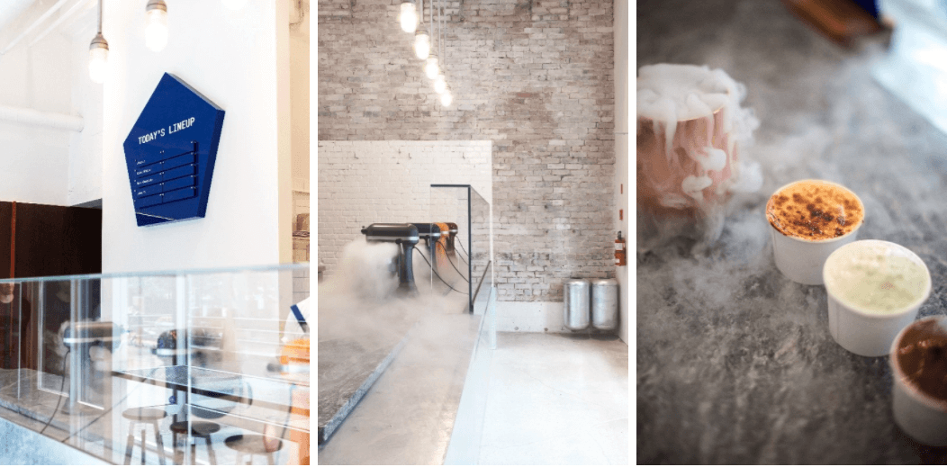
Your Vancouver ice cream shop is so playful in its multi-layered approach to creating meaning. First of all, the (selectively incompletely) whitewashed bricks work as an aesthetic complement to the liquid nitrogen ice cream they make on site. Almost as if you’re in some kind of cloud world. Then it has this semantic connection between the industrial aesthetic of the nitrogen steam and the ragged brick – it feels like a factory, in other words. They’re literally churning out goods. And then there’s the historical link – it actually was a factory so you’re celebrating that. Is it ever a case of ‘perfect building for the project’ or are you always able to impose meaning so skilfully?
We generally don’t aspire to the imposition of meaning in our work. Ideally, if we are consistent with our approach to a project there may a level of completeness to it which allows others to derive a variety of meaning from their own experience.
Mister, in many ways was similar to Fig in approach. We were interested in using material solutions which were functionally applied to the found conditions of the space: a cleanable gloss paint was applied in the areas of preparation, the service areas galvanized for durability and soapstone used for the areas where food and nitrogen would be in contact with it.

You used contrasting pieces of marble on the countertop, nodding to the contrasting swirls of various ice cream flavours. It’s both so joyfully free and yet works as a stunning piece of stark design. How do you balance the need to be tasteful with the opportunity to mess around with signifiers?
The Quebec soapstone was selected for its functional attributes as a laboratory grade top for thermal shock and as durable material that wears in well. Compositionally it provides a dark backdrop to the vapour while the adjacent galvanizing is something which is emphatically cold. Both in its crystalline structure and in winter memories of the signpost waiting at a bus stop or the detailing of a ski chair lift.
Just goes to show, you don’t need to resort to icons of anthropomorphised ice cream cones wearing mime gloves to have fun. Should every engineered space be such a work of art or would the world be lost without a bit of brut Americanism in industrial design?
Vancouver is a place where the grey rainy winter months are confronted with a determined desire for recreation which is facilitated by lurid coloured technical rain and active wear.
Somehow this relationship between technical functionalism and play is a strong part of the culture here.
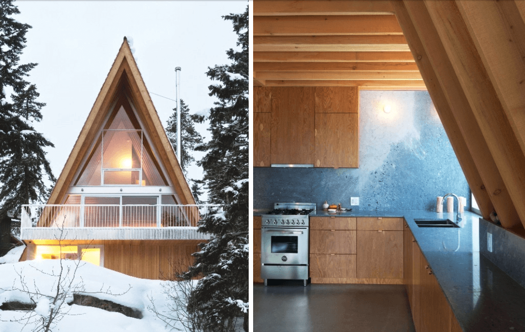
Your mountainside A-frame cabin in Whistler looks like it came right out of a Bond movie. It’s a real 70s period piece, right down to the minimalist clean-lined railings and flat planes of concrete at the base. We get the sense that – as well as a drive toward visual metaphor – there’s something of a pop culture streak running through your work, is that fair to say, even if it’s mostly a rejection of populism?
It’s likely that there is more of an embrace of everyday life then a rejection of it in our work as it is as much a result of our cultural experience as our professional background. Our childhood memories of ski cabins and family restaurants shows up in our work as much as the compositional and technical aspects of our trained architectural discipline. Watching The ski chase scene in ‘For Your Eyes Only” as a youth was a pretty thrilling memory; however, the inspiration for the A-frame was much more rooted in the use of local standard lumber in a form which addressed the steep site in a singular manner.
Is it perhaps that you enjoy conjuring uncanny visions with your work – finally realised executions of ideas that existed in the mind as memories or reflections of things half-seen?
It’s not a conscious determination. The work is a series of puzzles and solutions which are tempered with our intuition and experience. If the result takes on a personal character this might be a coincidence of our direct involvement in the work.
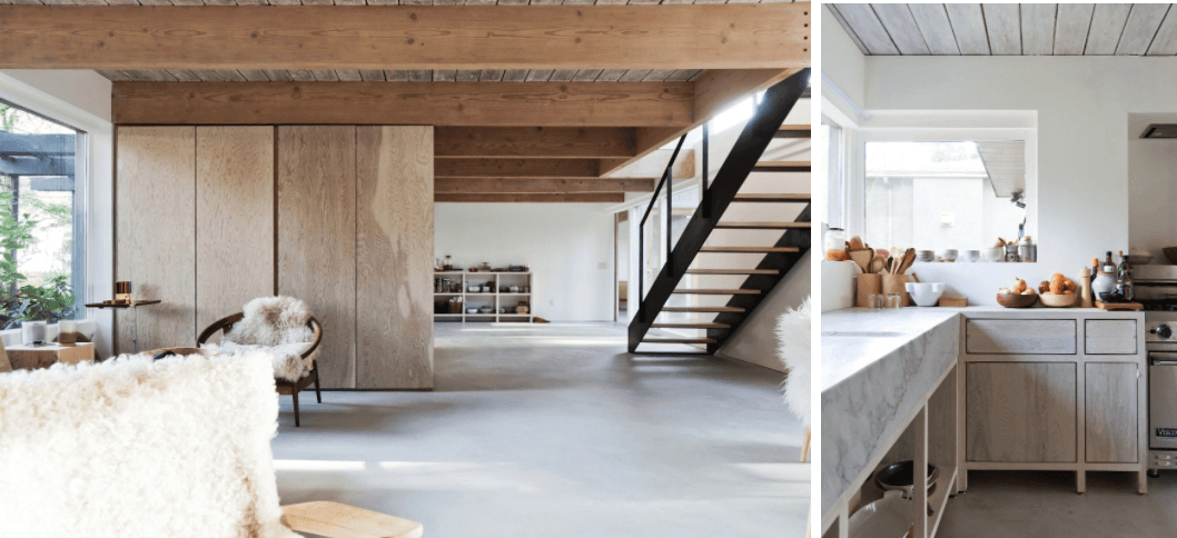
Simple techniques like strange juxtaposition mark some of your most successful work. Your Mid-Century mountain house project, north of Vancouver, adds contrasting surfaces of different types of wood, whitewashed walls, concrete floors and a marble sink in what feels like a conscious eschewing of Minimalist conventions. Yet it’s all beautifully balanced for tone and emotional impact. Where does gung ho ambition end and prudence begin?
The North Vancouver House was influenced by our decision to execute the construction work out of our studio and our client’s interest as historians in traditional material approaches.
The approach was more an act of direct editing and erasure of past interventions than one of conscious design.
The clients engaged us to design a new house and were in the process of finding a site when they discovered this home. There was a very comfortable relationship between the house and the mature landscape it is situated in and the spaces within the home, while small, had very generous proportions.
The efforts were focused on the removal of an enclosed stair which limited the southern light’s extent into the space; reducing the scale of details; grinding and trowelling the floor and brightening the wooden surfaces which had received a variety of finishes over the years. The kitchen was crafted of solid materials as a determined rejection of the easy act of perpetual remodel that the house had seen prior.
To find out more about David and Susan Scott’s work, visit scottandscott.ca and to read more about architects whose material considerations are of paramount importance, check out our interview with RIBA award winner Niall Maxwell.