RILUXA CLIENT PROJECTS
A Crisp Update to a Children’s Bathroom Designed to Stand the Test of Time
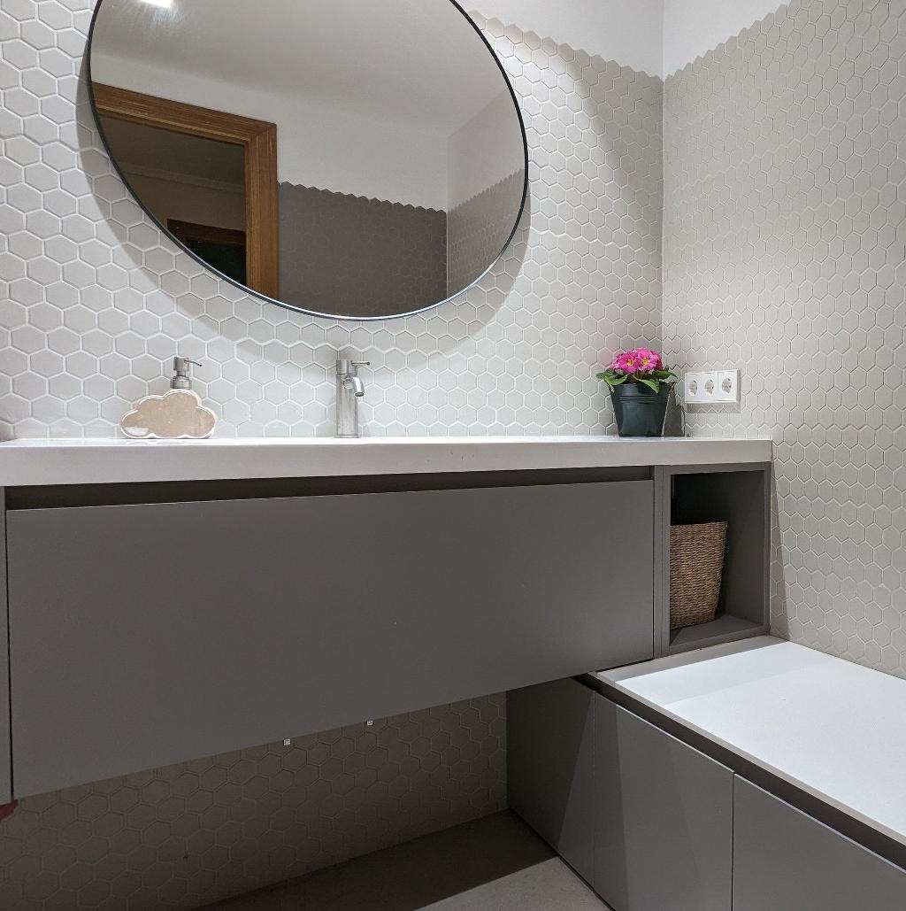
Beautiful, ultra-modern and practical were the watchwords when it came to renovating this children’s bathroom. Faced with a room that needed a complete overhaul, we were struck by the clean and modern lines, the minimalist colour palette and the furniture that cleverly doubles up as seating.
A kids’ bathroom might very well be the hardest working room in the home – it needs to be tough enough to withstand toddlers’ splashes and minor tsunamis, as well as adapt to their changing needs over the years, and to look good doing it!
Riluxa’s client, Paula in Spain, focused on high-quality, resilient materials, and kept both her materials and colours consistent throughout for a more cohesive look.
Tell us a little bit about yourself—are you a homeowner or a design professional, and where do you live?
I am a 38-year-old mum of 2 young kids (4 & 5), who lives in Spain where I work for an Online Company. I really enjoy decoration projects (and decoration TV shows!), arts & crafts, cooking and having fun.
Tell us about your bathroom project—was it a renovation or did you start from scratch? How long did it take and did everything go as planned, or were there any unpleasant surprises along the way?
We live in an apartment that has two full-sized bathrooms, but unfortunately it had been a lifetime since they’d been updated (25 and 30 years ago or so!). As well as being outdated, they had the wrong layout for our family. The ensuite bathroom had a bathtub and the kids’ bathroom only had a shower tray.
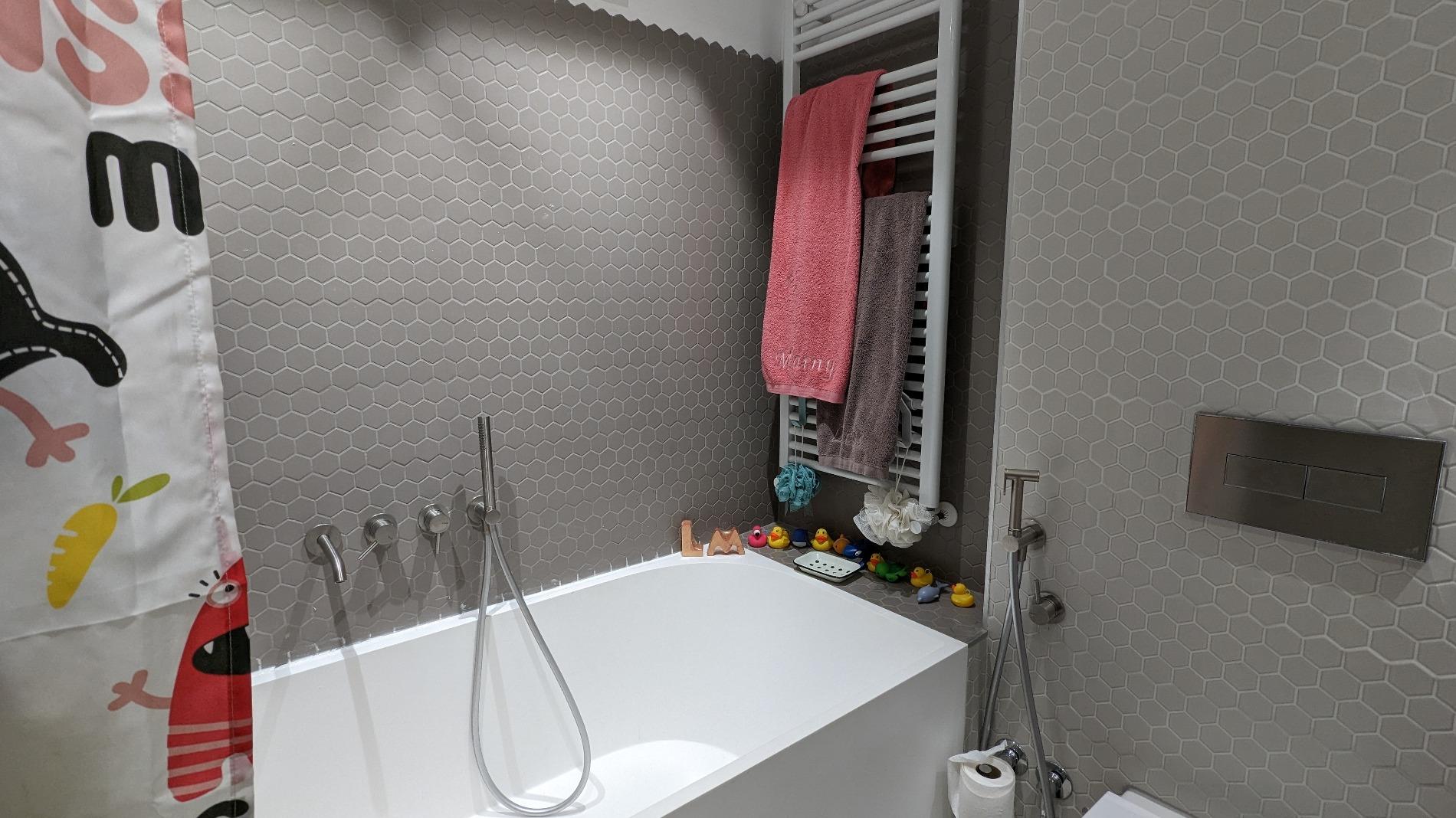
We chose to renew the kids’ bathroom first, so we could put the bathtub in place and they could continue taking their baths with no disruption. The project took longer than expected as the tiles we chose were very hard to install. The company hired to do the job did it wrong and unfortunately had to take them down and start over again.
Tell us the story of your Riluxa relationship—how you found us and what your experience has been?
As a fan of deco & architectural magazines, I had read about Corian®/Solid Surface material and knew I wanted to have it in my kids’ bathroom, both because of the clean lines that can be achieved with it and how practical it is when it comes to cleaning and maintenance. I did an online search and found Riluxa's website and started browsing through their products.
I talked to one of their consultants who helped resolve some doubts I had and also helped me narrow down my choice of bathtubs as I could hardly pick among all of them! Communication was so nice that I went ahead and ordered everything I needed with Riluxa, who went above and beyond to help me find the right furniture and items for my needs.
Everything was delivered when needed and if I had any doubts or questions (for example, the best cleaning practices) they’ve been very happy to assist, both the sales professionals and the post-sales team.
What Riluxa pieces did you use in your project?
I found most of the products I needed right on Riluxa’s website but I also had some pretty specific ideas about how I wanted to position the furniture and about adding extra doors to suit our needs. My contact in Riluxa gave me really good advice and was able to arrange the customisation over the phone (following up with the technical drawings). I used:
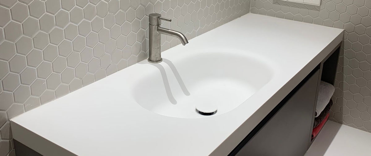
- The Lyra Corian® washbasin with extra countertop space, over a customised Gaia vanity base
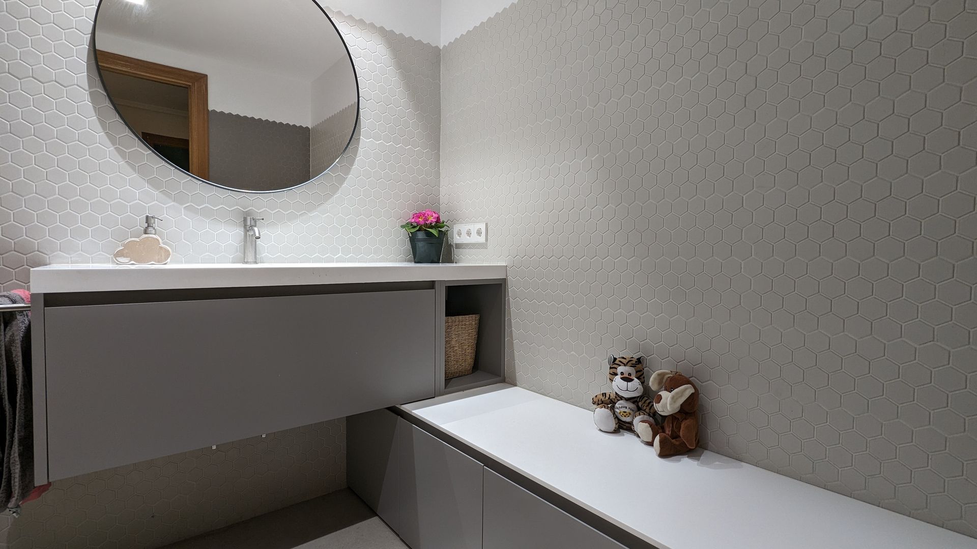
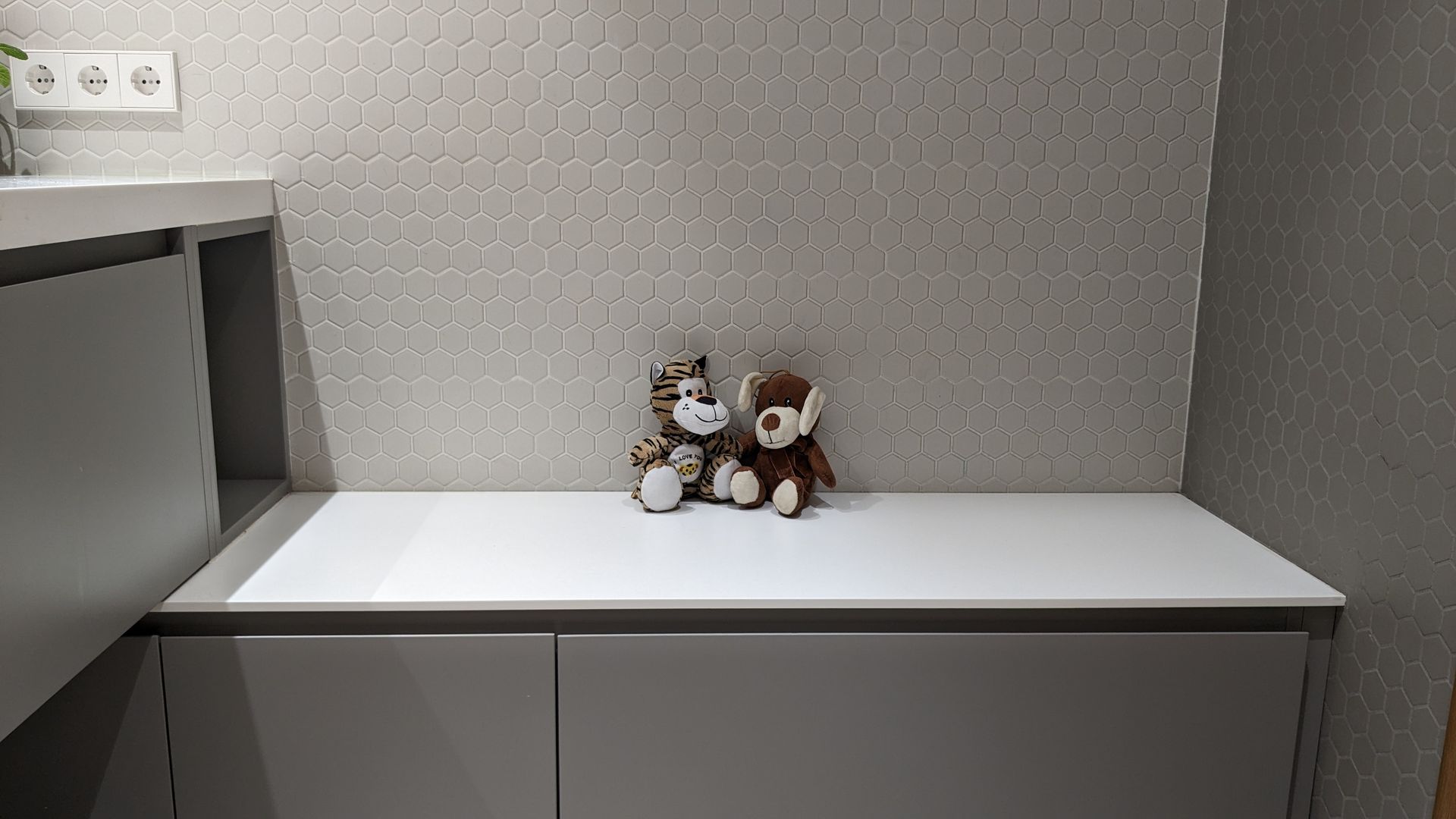
- A matching grey Gaia bathroom cabinet, which I customised with a white Corian® worktop
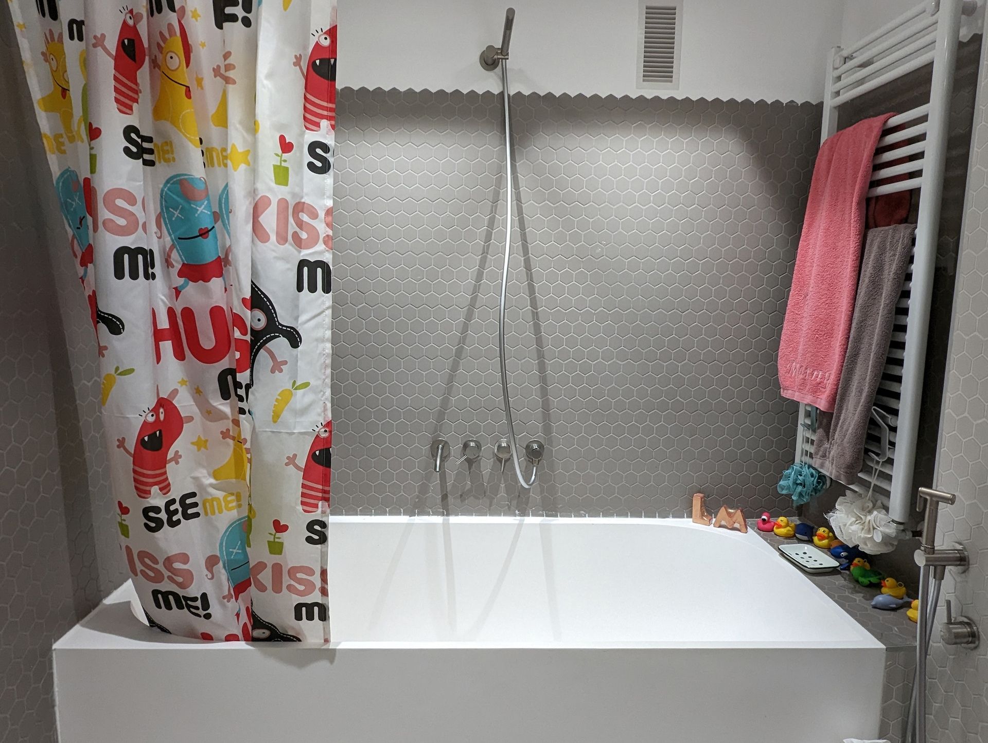
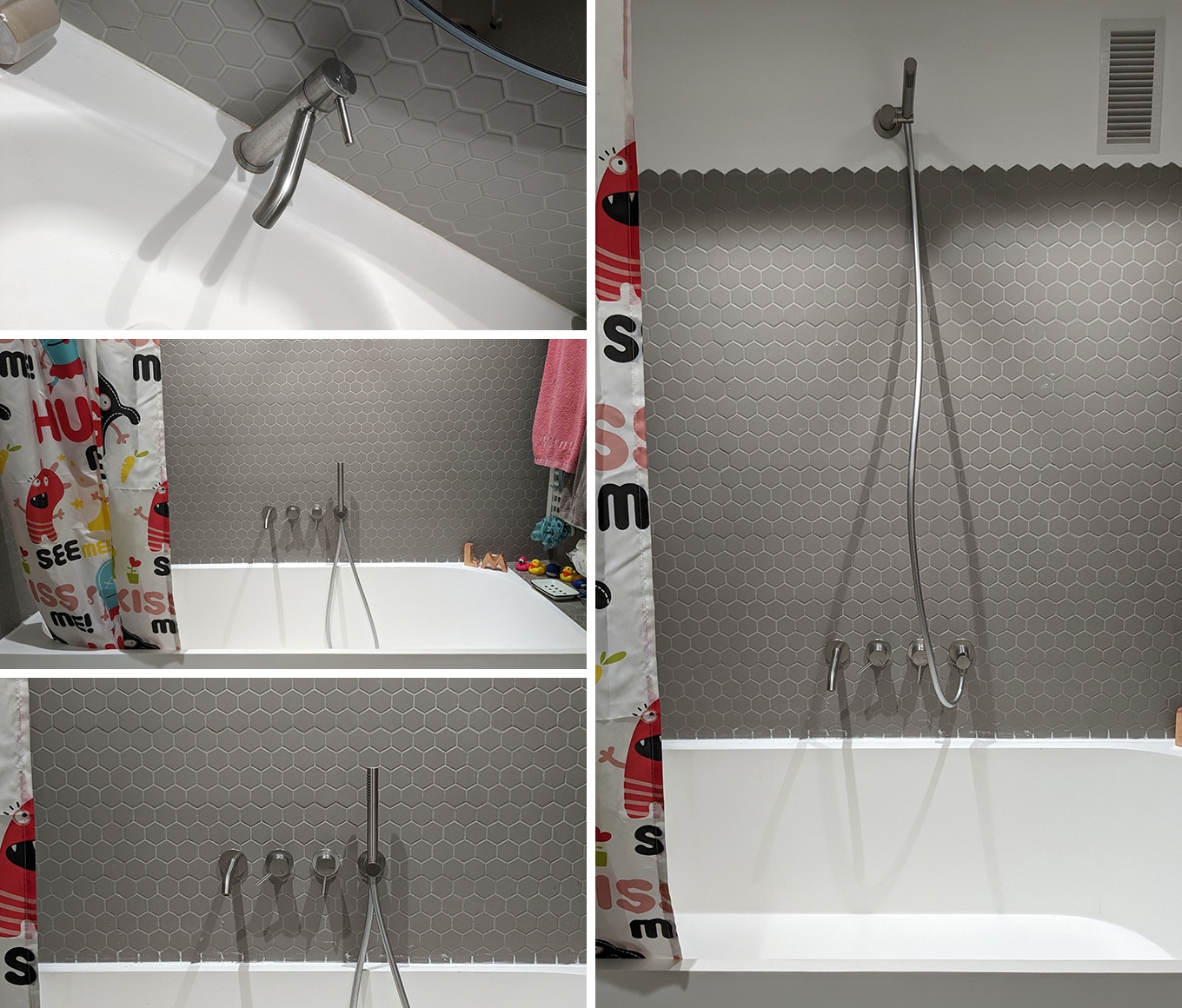
- And then the taps for the bathtub, the bidet shower and the sink also came from Riluxa – they’re from the Twins Yacht collection.
And which would you say is your favourite piece out of all the Riluxa products you used?
Well, I wanted a bathtub of maximum 170 cm and it had to be double-ended – so that the taps and drain are in the centre, which is perfect for my kids to share. I love its crisp, modern exterior and its soft rounded interior for comfort.
Great storage was also an absolute must for a kids’ bathroom, so the made-to-measure Gaia cabinet I placed on the floor is another favourite. I opted for concealed drawers and two extra doors, so it gives ample storage for a family of four. It also doubles up as a bench for the kids to help them get dressed, and they absolutely love it!
What design style were you going for – and where did you look to for inspiration?
I wanted a style that would be quite neutral so that it would stand the test of time, but that could be freshened up with little changes from time to time. I also wanted something that could be used by my young kids now but wouldn’t be too childish when they grow up and become … arggghhhh … teenagers!
Tell us how you feel about your project now that it's finished:
I love my bathroom. I think it's both beautiful and practical. I think the bathroom is super modern and I have gotten nothing but compliments from every single person who’s seen it, since it looks even better in person than in pictures!!
If I were to change just one thing, I might have gone with two separate, smaller sinks rather than one large one to avoid the kids fighting over whose turn it is. But to be fair, they would probably find something else to fight about!
I’m definitely planning on contacting Riluxa again for my main bathroom project as they were extremely professional and the products have lived up to the standard I was expecting.
Is there anything else you’d like to share with our readers? Do you have any advice for future Riluxa customers wanting to create their dream bathroom?
If I could give any advice, it would be to give yourself time to plan and make decisions, don’t rush into choosing anything and, once the project gets started, brace yourself and be patient. It will all be so worth it in the end!
If you would like your bathroom project to be featured on Riluxa's Client Projects Showcase, tag #riluxa @riluxa on Instagram or upload your images directly by clicking here. We love nothing more than seeing how our customers have used Riluxa products to create their dream bathrooms.