
MEET THE DESIGNER
Riluxa Meets Sabrina Julian of Studio Beau Faire
It is always exciting – and flattering – for a designer when they are given carte blanche on a project. That’s exactly how Sabrina Julian, of Studio Beau Faire, came to create her signature project – Amelot Street. This Parisian apartment under the eaves now basks in a jewel box palette of rich hues, natural stone and softly bleached wood.
Sabrina spoke with Riluxa about the influences and inspirations she brought to the stunning Amelot Street renovation, transforming its imposing beams into a hugely charming feature. This is especially evident in the beautiful bathroom, where Riluxa’s flowing Biham bathtub takes pride of place. She also shared her broader perspective on style and bathroom design trends in particular. Read on for a wealth of inspiration and advice on how to approach your own bathroom transformation.
First of all, tell us a little bit about yourself and your background. How did your career in design begin?
My name is Sabrina Julien and I’m the founder of the Interior Architecture practice Studio Beau Faire. We’re based in Paris, in the 11th arrondissement.
I’ve always wanted to work in the world of interior design. To be honest, by the age of 12 or 13 I already knew I wanted to do this job. So, I enrolled in the École Boulle school of Fine Art & Crafts in Paris, which is renowned as a furniture-making school. My speciality was in Spatial Design in Applied Arts. Originally, the focus of the school was to train furniture-making professionals, such as cabinetmakers, carpenters, upholsterers. They did this initially by copying fine works of the past, primarily those linked to Louis XIV, which is why the school was named after the king’s cabinetmaker: Charles-André Boulle.
When I started out working for a studio, I worked in retail on commercial premises. But when I set out on my own, I gravitated naturally towards private clients and I’ve really thrived in this sector. When starting the agency, I worked mainly with studio apartments (15-20m2), where you have to consider every last detail down to the millimetre to fit everything into what is a real apartment. In fact, I think my training at École Boulle really served me well, especially the strong focus on joinery.

A project in Belgium involving the complete renovation of a retail outlet. Photo credit: @DesPetitsHauts.
I actually try not to have a style that's too pronounced, so that I can remain open to my clients and their personal taste. I also try to break free from current trends, and to stay away from anything too decorative. I like to offer clients environments that they won’t tire of over time. That, for me, comes down to choosing beautiful materials with understated lines. I like simple things and the idea of not being fixated on ‘design’ at all costs. When a space is well thought out with beautiful materials and beautiful lighting, there’s no need to add window dressing to decorate; the space itself is enough.
Could you talk us through your creative process – how do you approach each client and each new project?
My creation process depends mainly on the apartment in question, because I always try to be in harmony with both the tastes of my clients and the type of apartment. A client once called and told me he’d fallen for my Amelot Street project. But I couldn’t use the same language in the Haussmann apartment he was about to buy, it wouldn’t have suited the place at all. He understood completely and we ended up looking for a new apartment together!
During the initial meeting, when I don’t know anything about my clients’ tastes yet, I bring a box of sample materials to find out what they’re drawn to or not, in a very natural way. Will the natural stone appeal to them, or are they more into graphic materials, colours, or is easy maintenance more important to them? Then I look at how the light is in their space and the space I have to work with, and I can start to direct them.
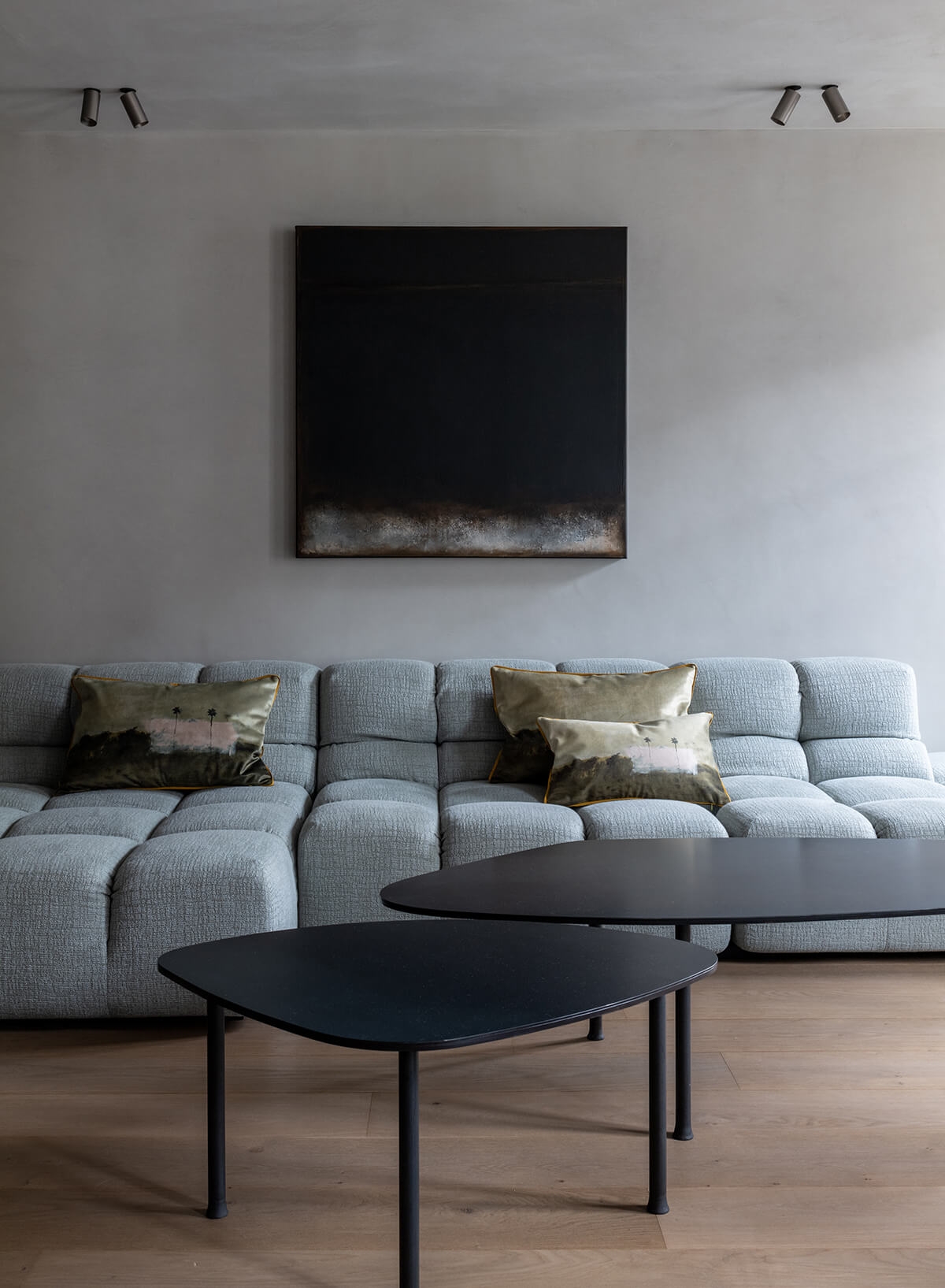
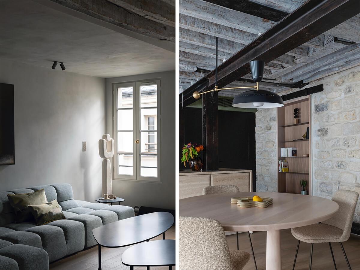
The elegant, muted tones of the renovated living room in the Amelot Street project. Photo Credit: Agathe Tissier.
Ultimately, my work involves bringing together many different parts into a unified whole. We typically start from one key element (such as a distinctive feature of the apartment, or a material) and we arrange the pieces around that, the project develops step by step. For example, in the Amelot Street project, the ground floor was naturally quite dark. I chose to work with muted tones, to enhance this sensation and work with the very special light that the space has. That meant using coats of limewash, smoked oak, shades of green, which ultimately gives a very minimalist and soft result. On the other hand, the upstairs was much brighter, so we opted for honeyed oak and more shimmering tones.
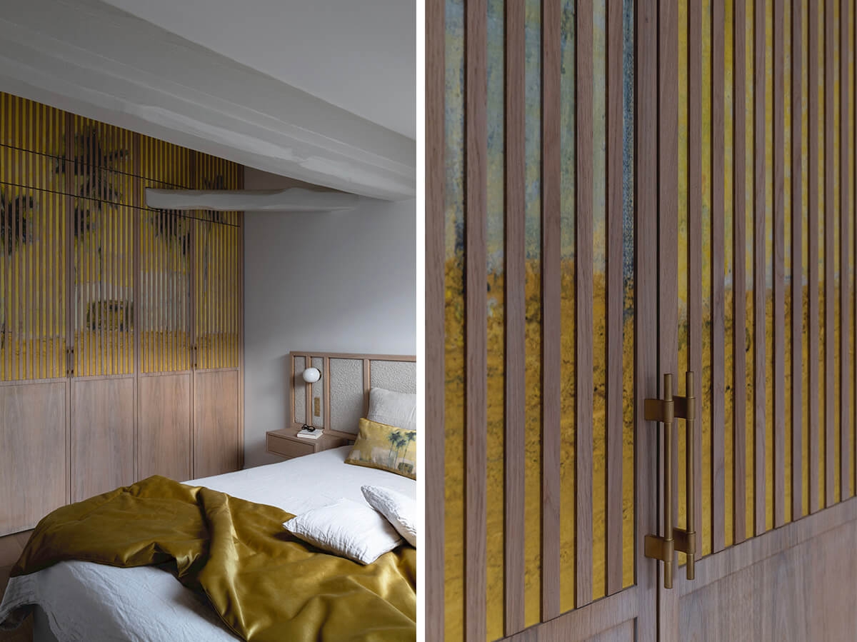
A closeup of the statement yellow-patterned wallpaper from Maison Levy in the Amelot Street project. Photo credit: Agathe Tissier.
I suggested that we introduce colour and give a little nod to my client’s Mediterranean origins by bringing the sun and palm trees into the bedroom. I chose a Maison Levy wallpaper that I particularly like, and had the idea of adding wooden battens on top to evoke a distant landscape as if viewed through shutters. That also allowed us to soften what was a rather strong pattern, so as not to overload the room.
For the bathroom, I designed a custom-made Iranian travertine basin - I chose the material for its red colour, which I combined with a slightly pink waxed concrete for the walls and floor. Then we then chose tapware in a brushed aged brass, and a cabinet made from bleached ash.
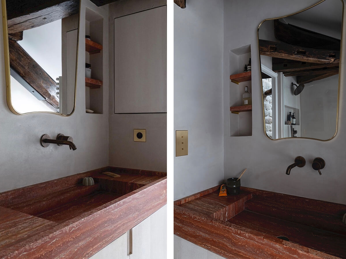
A washbasin in Iranian red travertine, atop a custom-built cabinet in bleached ash. Photo credit: Agathe Tissier.
In this bathroom, the space was complicated somewhat by the sloping roof and a beam that crosses the room. But that’s also what gives the room its charm. The unused space under the roof meant we could include a bathtub, and I wanted one as minimalist as possible as it will only be used occasionally. The shower and bath are separated by a half-wall to keep the space as open as possible.
We definitely couldn’t place the typical shiny acrylic bath into a project with such high-end finishes. Initially, I thought about creating a moulded concrete bathtub, continuing the material from the floor and walls, but the weight and installation were problematic. So we had to find an alternative that could offer the visual simplicity I was looking for, and Riluxa's Biham Mini bathtub in solid surface was perfect for that. I like the very thin edges and the detail of the light wave inside, which must be very pleasant to use. The matte finish of the bathtub gives it a very luxurious look.
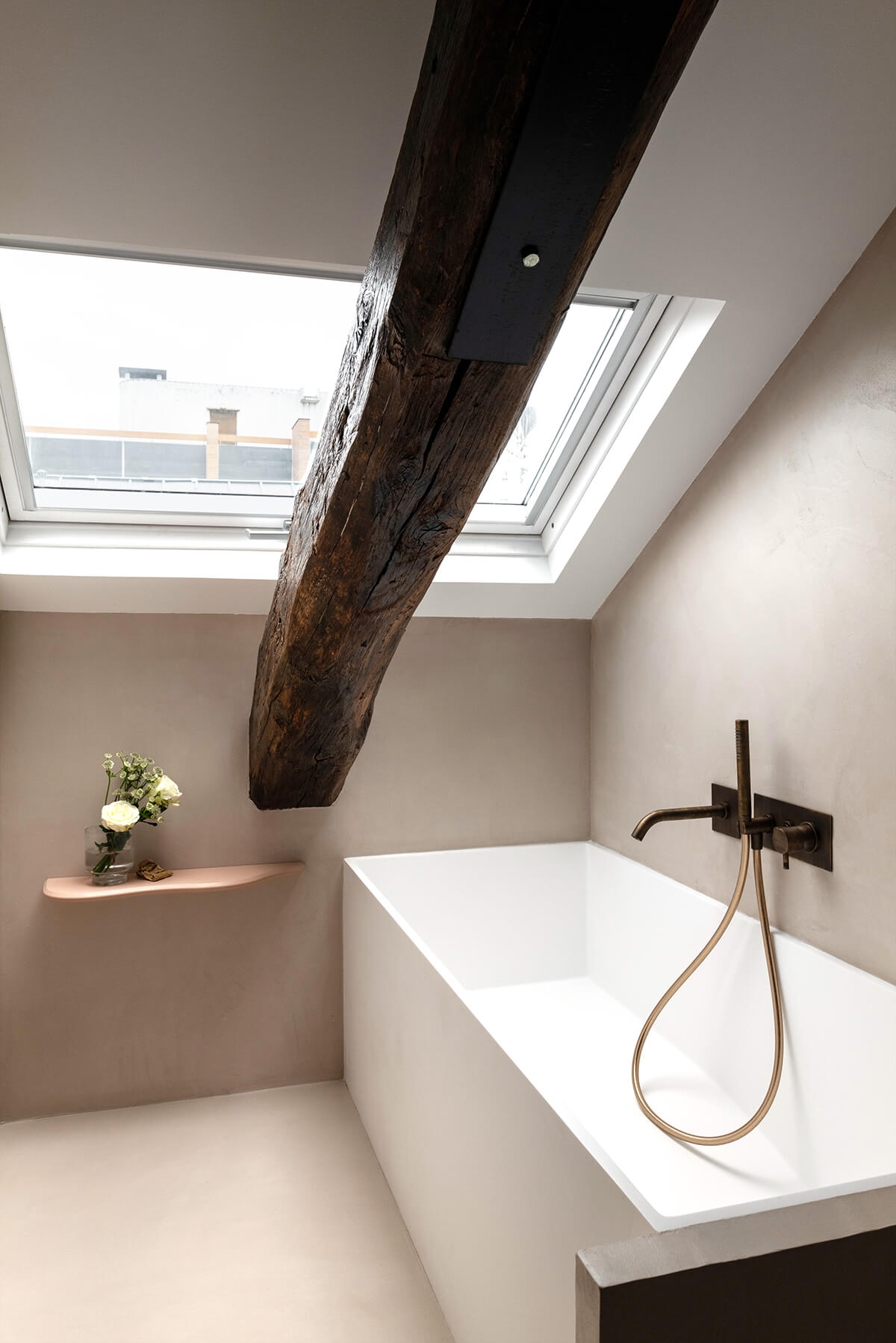
The bathroom of the Amelot Street project features Riluxa’s Biham Mini bathtub in a beautiful private setting under the eaves. Photo credit: Agathe Tissier.
What inspires you? Do you have any particular resources or sources of inspiration you return to time and again?
Like most people, I look at what my peers are doing, especially on Instagram or Pinterest which are my main sources of inspiration. But I find it can be hard to take inspiration from others without copying. That’s why I try to keep some distance so as not to fall into that trap. I make folders where I save images I like and then reimagine them, sometimes taking inspiration from a material or a form that I reuse in another way.
I also like to look at the work of the big names in interior architecture, people like Rodolphe Parente, Pierre Yovanovitch, or Joseph Dirand, among others. I love the minimalism of Belgian designers, I find them very strong in interior design. At the same time, the exuberance of Italians is very appealing. It’s a clever blend, you have to get the quantities right...
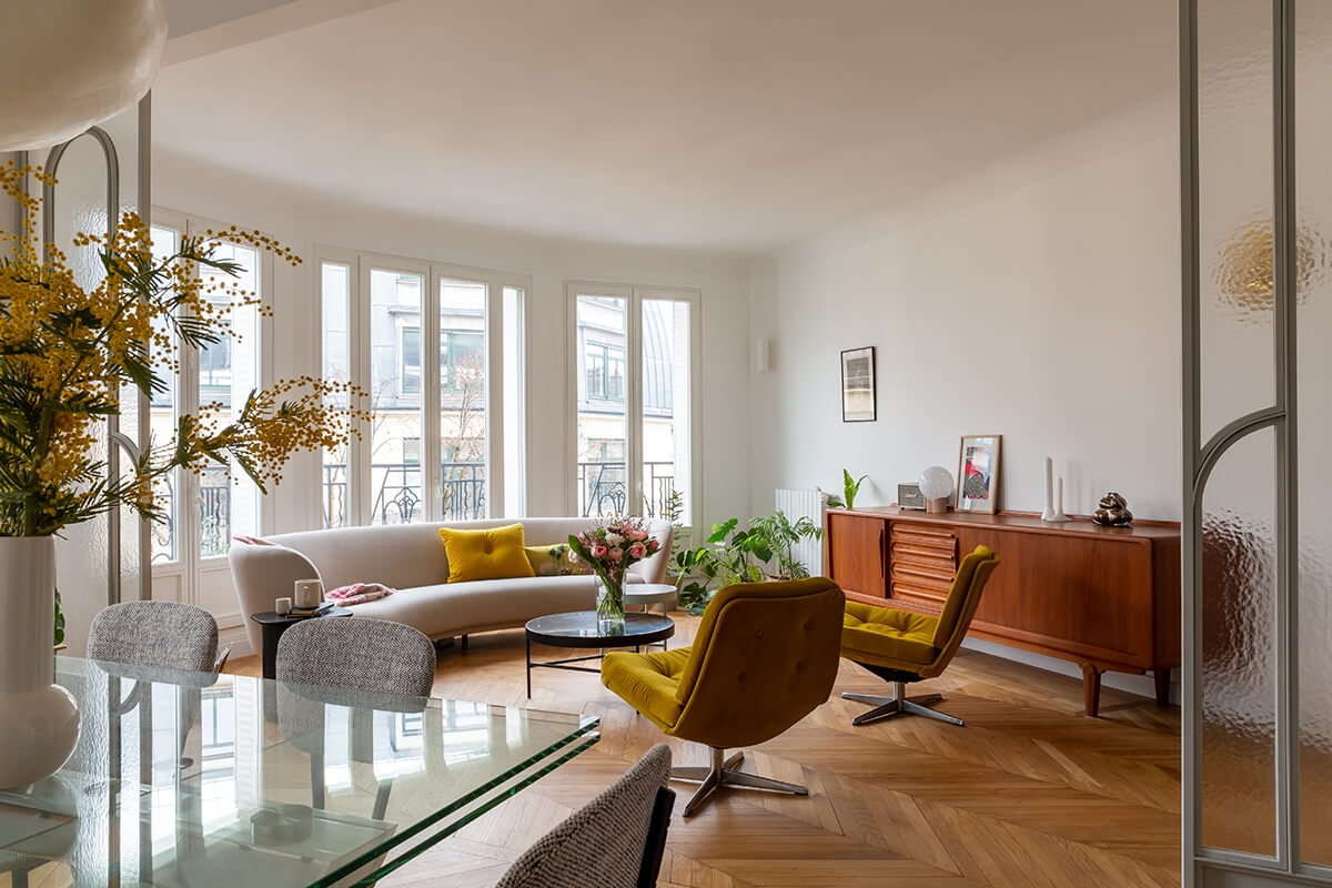
How a pop of colour introduced by decorative accents can transform a room. Ledru-Rollin Street project. Photo credit: Agathe Tissier.
Do you have a signature style? How would you classify it?
That’s quite a tricky question because it can be hard to take a real step back from our own work. If I had to define my style, I’d say that it’s quite simple and practical, contemporary, with a focus on beautiful materials. I keep the materials as natural as possible, so I like to use natural stone or solid wood whenever I can. As a general rule, I try to avoid “artificial materials” as much as possible – I don’t like to use parquet-effect tiles, even though I completely understand how practical they can be.
What would you say are the key trends within the world of bathroom design right now?
I’m noticing the use of a lot of mosaics and ceramic kit kat tiles. Personally, I’m incorporating these types of products into several of my projects. Another trend I’m enjoying is the use of a single material across the bathroom, where you can’t really tell where the material begins and where it ends, like with polished concrete. In fact, that’s a great trick when you’re dealing with a smaller bathroom.

A perfect blend of mosaic tiles and polished concrete surfaces in Beau Faire’s George Sand Street project. Photo credit: Agathe Tissier.
Tell us about your relationship with Riluxa and why you’ve chosen to use Riluxa pieces in some of your projects. Which products have you used?
Originally, I got to know Riluxa through your marble wall-mounted basins. I also like your beautiful bathtubs, because they’re not the typical baths that you find in every other shop. An example of that is the Biham Mini bathtub in solid surface that I used in the Amelot Street project. I’m especially fond of your freestanding baths because they’re particularly original. I’d like to make even more use of them but they don’t always suit the types of projects I work on.
Best piece of advice for people renovating their bathroom or designing a new bathroom from scratch?
My first piece of advice would be to combine beauty and utility by creating niches to the sides of the basin and in the shower, to avoid having products on every surface. I’d also advise people to have fun playing with sizes and materials, by combining small wall tiles with a large tile on the floor, for example. The rest is all about the details: matching the switches and sockets to the taps, not forgetting the lighting by choosing an attractive light, as well as spotlighting. A wall-mounted tap is a great way to free up the countertop, it’s always useful to have space around the basin.
What’s been your career highlight to date and what do you still dream of achieving?
I actually think the Amelot Street project is my proudest accomplishment so far. The clients really listened to my ideas and allowed me to guide them. You could almost say they gave me carte blanche, so it was very enjoyable to work with them and see how much they appreciated my ideas. I would say that’s my signature project, the one that best reflects me. As a matter of fact, I was redoing my own apartment at almost the same time and a lot of the materials I chose for Amelot Street can also be found in my own apartment!
As for my dream project, it would have to be to renovate a small hotel!
Are you currently reading any interesting books you’d recommend?
Right now, I’m reading Virginia Woolf’s A Room of One’s Own, a classic of feminist thought. I like the idea of a having personal place to recharge, a place to rest, but also to reflect and think.
To learn more about Sabrina and to view more stunning imagery of her studio's work, check out @beau.faire on Instagram and https://www.studiobeaufaire.com/.
Photos shared courtesy of photographer Agathe Tissier: https://www.instagram.com/agathetissier.photographe/.
If you would like your bathroom project to be featured on Riluxa's Client Projects Showcase, tag #riluxa @riluxa on Instagram or upload your images directly by clicking here. We love nothing more than seeing how our customers have used Riluxa products to create their dream bathrooms!