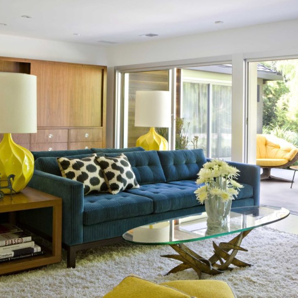
The Enduring Allure of Mid-Century Modern
The end of World War II in 1945 signalled a collective sigh of relief across the globe. The war had brought with it austerity across Europe as well as having immediately followed The Great Depression that blighted America throughout the 1930s. The freedom tasted in the mouths of the world’s creative communities as the 1940s drew to a close was strong.
With victory over the Nazis came a readiness to celebrate life, gifted, as it was, back to the world from their clutches. It prompted people to re-evaluate the sameness of their lives and the surroundings within which they were lived. Art and industry, appropriately, entered into one of the greatest periods of gung-ho ingenuity and invention since the Industrial Revolution, which had ended roughly a century earlier.
In the world of interior design, it culminated in a style we now refer to as Mid-Century Modern. Its impact on the way people viewed the world was almost as dramatic and lifechanging as the Industrial Revolution itself. And its reverberations can still be felt today, emanating from the very core of the way we engineer, build, design and dress our homes.
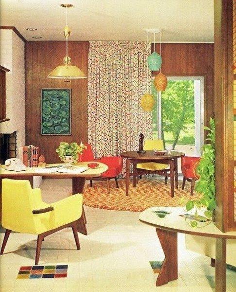
A typical example of a 1960s Modernist interior
What are the signature themes of Mid-Century Modern?
The phrase that’s most enduringly associated with Mid-Century Modern is one you’ll be very familiar with, if you have even the vaguest interest in interior design: clean lines.
Prior to the 1950s, the constructive and decorative arts had been largely concerned with the showiness of craftsmanship, with elaborateness as the highest demonstration of quality. The automation introduced during the Industrial Revolution had, of course, forced Victorian practitioners to simplify approaches to decoration under the Modernist dogma of Utilitarianism (that which maximises the usefulness of a given design). The German Bauhaus movement of the 1920s and early 1930s then established the notion that beauty could be achieved via the process of mass production. And, as Bauhaus practitioners fled Germany for America during WWII, the International Style grew out of it, popularising mass-produced simplicity as a means toward aesthetic achievement.
It was not until the post-war period, however, that the clean lines and gentle organic curves of what we now refer to as Mid-Century Modern really took hold in the minds of the publics of the Western world, now all back to work amidst economies boosted by peace and technological advancements, with money to spend and the luxury of time within which to spend it.
The 1969 album Fantastic Glissando by Minimalist composer Tony Conrad
The aesthetic doctrine they were exposed to was one that had begun to take hold across multiple art forms: Minimalism. From music by the likes of Minimalist experimenters Tony Conrad and Terry Riley to painting and film by practitioners such as Robert Ryman and Agnes Martin, cultural production focused heavily on abstraction and stripped back simplicity – bringing objets d’art back down to their very essence in order to better examine what qualifies their definition as such. In other words, it was a way for art to more confidently self-identify by baring its most basic elements.
In architecture, we find the rise of Brutalism, which emerged in the 1950s in the form of gigantic, monolithic, geometric structures, largely constructed from poured concrete that were unlike anything the world had ever before seen. And the interior design that came with it was very much complementary in its stripped-back essentialism, dynamic self-confidence and use of bold, new colours, textures, materials and shapes.
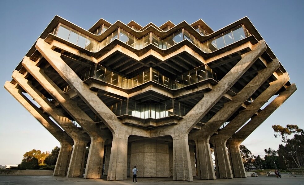
Giesel Library, University of California, San Diego, CA, USA
Who were some of the key players?
Department store culture was at its height between the late 1940s and early 1970s and stunning Minimalist interior products by the likes of Hans Wegner, Frank Gehry and Finn Juhl populated these giant paeans to the world’s favourite new freedom-expressing, bourgeois hobby: shopping.
Frank Gehry
Born in 1929 in Canada, Frank Gehry is of course best-known today as the architect behind the Guggenheim Museum in Bilbao, Spain – one of the most startling examples of contemporary postmodern building styles. But he also famously produced a line of furniture between 1969 and 1973 that could be said to be the defining example of Mid-Century Modern, called as it was, ‘Easy Edges’. Constructed entirely from engineered cardboard, his signature ‘Wiggle Side Chair’ for Vitra is the ultimate exercise in simplicity with fun, funky, curved cardboard denying the necessity for any further decoration. The modern timelessness of the Easy Edges range comes from its ability to wow us with an uncanny combination of familiarity and alienation. We recognise it for what it is and, yet, it feels completely unlike anything we’ve ever seen before.
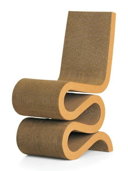
Wiggle Side Chair from the Easy Edges range by Frank Gehry
Hans Wegner
The mid-20th Century witnessed an explosion of Minimalist furniture design from Denmark. One of the key practitioners of Danish design was Hans Jørgensen Wegner, born in 1914 and trained by master cabinetmaker H. F. Stahlberg. Today, his designs can be found in world-renowned galleries and museums, but at the time, the likes of The Peacock Chair, The Chair (a simple, carved multi-purpose chair in oak, ash, cherry or walnut with wicker seat) and Wishbone Chair (which, yes, looked a bit like a wishbone) were mass produced for the world’s growing middle classes. Like the vast majority of Mid-Century Danish design, it was simple, gently curved, elegant and utilitarian. And the ultimate style statement for those wishing to extricate themselves from the monotonous flamboyancy of pre-war elaboration.
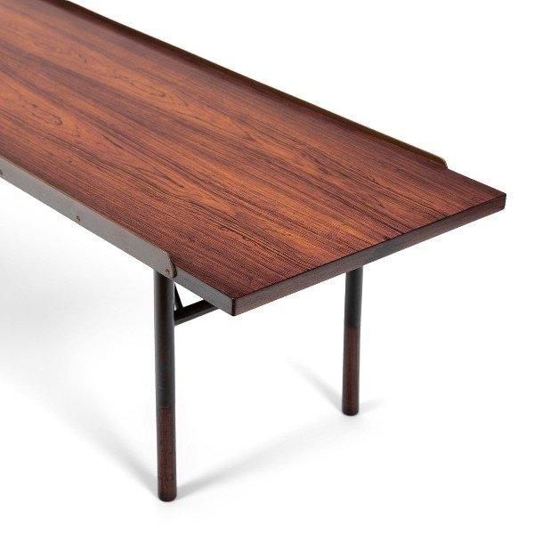
BO101 coffee table by Finn Juhl for Bovirke
Finn Juhl
Another Dane who was central to what we have now come to recognise as Mid-Century Modern design was Finn Juhl. An architect, as well as an interior and industrial designer, Juhl (born in 1912) was the designer responsible for introducing Danish Modern to the American audience, thus ensuring its place in the mainstream culture right up until this day. The factory production methods employed to realise his designs were emphasised in their nomenclature. Harsh, joyless names such as the NV44 chair (in Cuban mahogany rosewood) and the BO101 coffee table (manufactured by Bovirke in Teak, brass and gunmetal) belied the cultural-revolutionary impact of their designs (it might be argued that the rebelliousness of their design was, itself, a joyous act, even as their style was consciously devised to minimise elaborate fun and maximise simple utility).
Why is Mid-Century Modern modern back?
As the 1970s gave way to the 1980s, materials such as aluminium, steel and glass made their way more extensively into the realm of interior design and technology such as neon lighting began to creep in from the exteriors of buildings to light up the world’s most fashionable residences and commercial interiors. Pastel colours, fussy prints and a clashing of country style with the Modernist drive toward the new turned people’s homes from Minimalist idylls into a somewhat more garishly cosy version of themselves. And, by suddenly fusing elements of nostalgia with elements of futurism, interior design reached a natural endpoint for stylistic ingenuity. The world had started to look backwards, rather than just forwards.
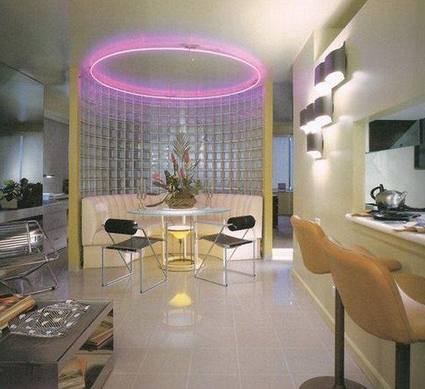
By the 1980s, Minimalism made way for PoMo reflexivity
This meant two things for the next generation of designers, raised in the 1980s and coming of age in the 1990s. Firstly, it meant that they had been trained by their parents’ generation to look in both directions for inspiration. Secondly, and crucially, because they were no less rebellious and no less determined to be different than any generation that came before them, it meant that they had to do something radical to piss off their parents. Which meant looking to the homes of their grandparents – the ultimate symbols of ‘uncool’ for baby boomer parents – for inspiration. (Is there any better way of sticking it to Dad than by telling him you think Grandpa is cooler than him?) And so Mid-Century Modern was revived barely a decade after its clean-lined cadaver had been given the chance to go cold.
In the two decades that have passed since the 1990s, examples of Mid-Century Modern have, of course, become more and more scarce. This has helped their transition from an initial hipster act of stylistic rebellion toward a more mainstream act of antique hunting as a means of demonstrating, via interior design, a more cultured worldview than that of the average home dweller. Mid-Century Modern style now inspires a great many of today’s designers, making it hard for the untrained eye to recognise the difference between the contemporary Scandi simplicity of an IKEA EKENÄSET armchair and a vintage 1962 Polish 300-190 lounge chair by Henryk Lis.
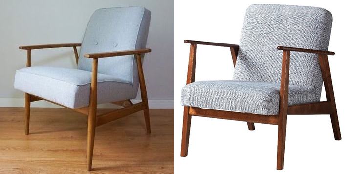
A Danish Mid-Century Modern antique and a modern Scandi appropriation. But which one's which?
And it’s no bad thing. We occupy a world, as we approach the third decade of the 21st Century, that gives us access to more effective factory production methods, a greater wealth of design history from which to draw upon and, crucially, a bigger sense of freedom than ever before to throw caution to the wind and fuse old and new, expensive and cheap, luxury and tat… A world where our obsession with Mid-Century Modern evolves into its natural successor - the Eclectic style. So, blink not an eye at your friends who live in the converted factory with the bare plaster walls housing a G-Plan dining table, Arteluce standard lamp, Lofty Black bathtub, Ercol bedframe and EKENÄSET armchair. Because they have something more than just disposable income at their fingertips. They also have the sense of freedom to do exactly as they please. And all in the name of good taste.
Read more about Interior Design here