How to design a Kelly Hoppen Inspired Bathroom
Kelly Hoppen CBE radically changed the interior design industry with her East Meets West philosophy, making her one of the most in-demand designers in the world. Her multiple-award-winning interiors shimmer with authenticity, individuality and sophistication. And the key to their success? In short: a combination of bespoke, luxury pieces crafted from the finest materials available and a simplistic approach to colour and feng shui that exudes tranquillity.
So, short of hiring the designer herself (which, if you have the budget, we highly recommend), how would you go about bringing a little bit of that Kelly Hoppen magic to your own luxury bathroom remodel? We took a look into some of the most frequently used tropes in the celebrated designer’s bathroom projects to give you a handy overview.
Make bold statements
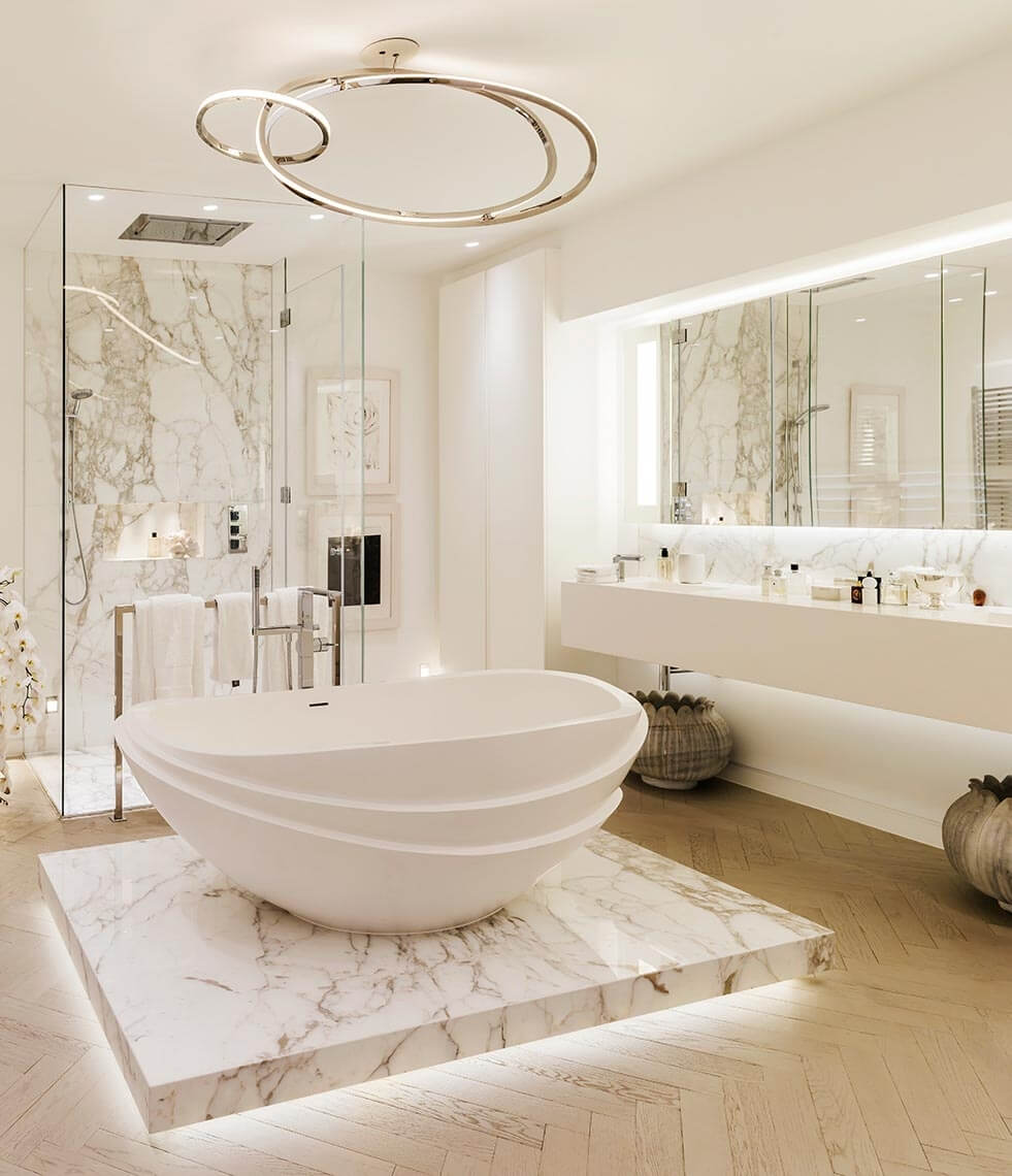
When you walk into a Kelly Hoppen bathroom, you really know which room you’re in. More often than not, the bathtub (or shower, if there is no tub) will be the focal point with the rest of the space feeling as though it’s been designed around it. Whether it’s a freestanding solid surface bathtub plinthed on a slab of Carrara marble or a shower with tiling that extends beyond the cubicle as if to guide your eye toward it, the fixtures are the absolute centrepieces of a Hoppen bathroom.
Play with reflection
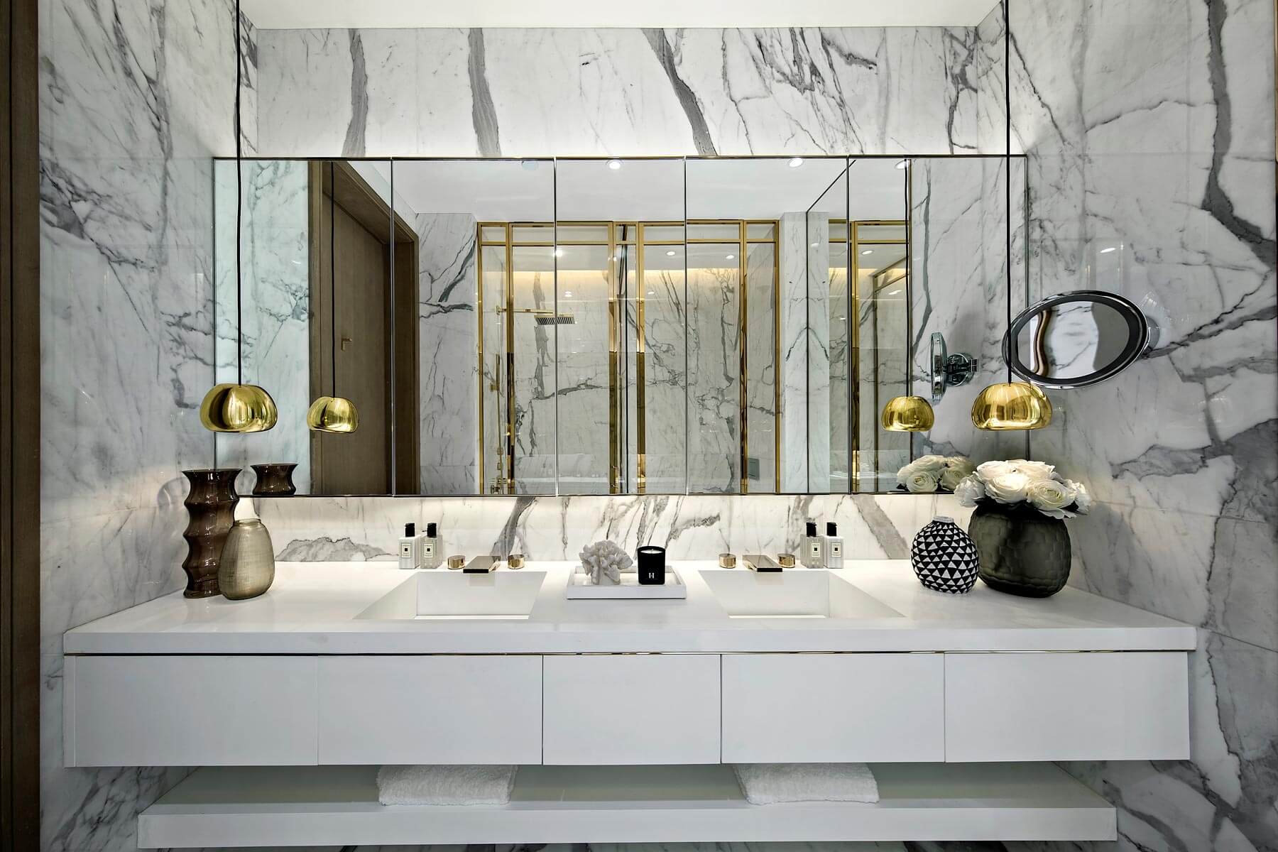
We all know that extensive use of beautiful mirrors will help to make even the grandest of bathrooms feel bigger. What Kelly Hoppen does with mirrors, however, is to delight the eye by making the reflection feel as if it’s an extension of the space we’re standing in, a view into another, complementary space or even a fragmentation of the room, reflected back in subtle cubist absurdity.
Conservative in its simplicity but nonetheless wryly imaginative, Hoppen’s use of reflection helps to remind the bathroom user of the opulence of the space they’re occupying, highlighting (as it tends to do) some of the bathroom’s most luxurious features, such as the gold framed shower cubicle you see above.
Use lighting as both a feature and a tour guide
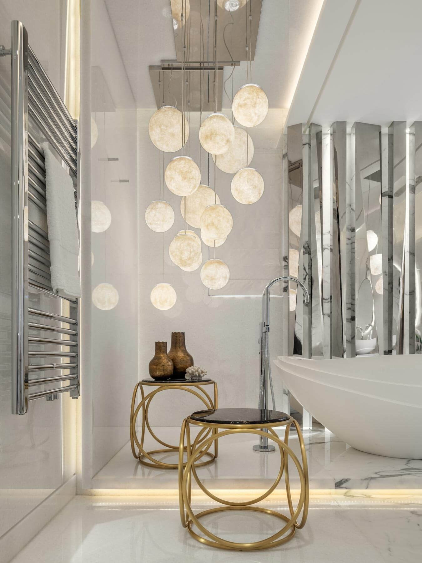
At its most rudimentary, lighting is used as a means of allowing us to see in the dark. Kelly Hoppen, however, uses lighting as a key aesthetic tool in enabling our enjoyment of the space. It not only draws our attention to itself in the form of stunning lighting arrangements, as in the above image, but it also enables us to more effectively enjoy the other features of the bathroom. The latter may occur in the form of up-lighting and/or down-lighting on a key feature such as a bathtub. Or, as you see in the image above with the fragmented light bouncing back onto the bathtub, it may occur in creative use of reflection to shine a light on the bathroom’s best bits.
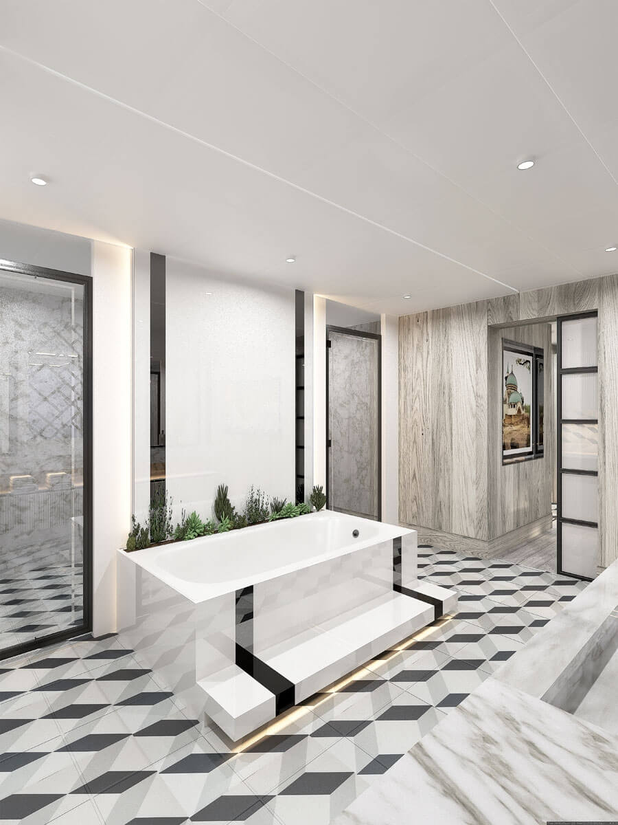
Juxtapose patterns for calm chaos
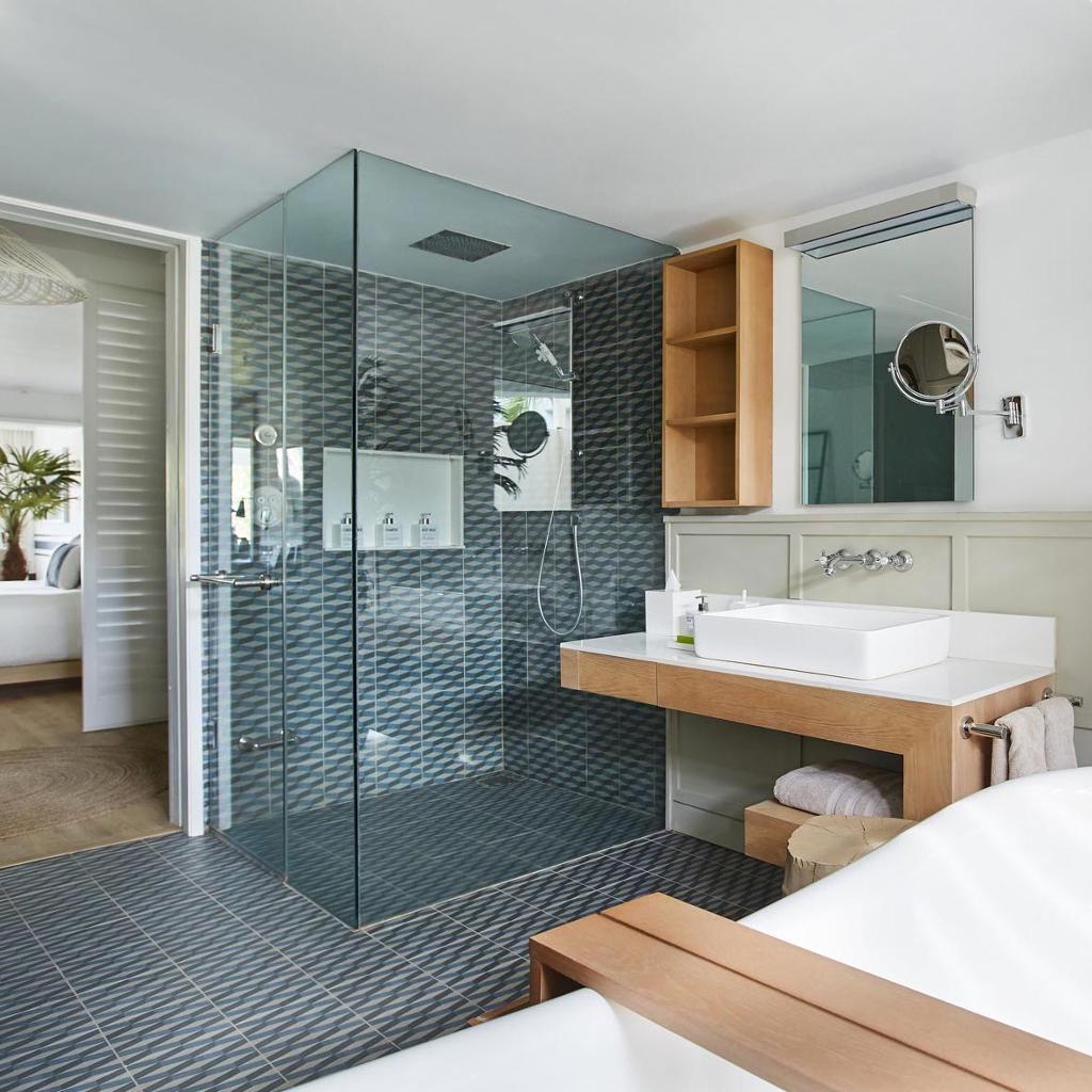
Kelly Hoppen has a talent, which few other designers are able to demonstrate, for creating clashes that don’t really feel so much like clashes. In a Hoppen bathroom, you may well find the clean lines of starkly coloured Minimalist products juxtaposed with everything from wood grain to swirling marble to bold geometric patterns.
What’s wonderful about these contrasts is that they excite the eye so that we don’t always know where to look first. (One set of lines may send us on a wild goose chase to a different familiar pattern that then only leads us to yet another set of contrasting shapes.) Yet, they do so without making us feel in any way overwhelmed in the way that a more overtly Maximalist space might. And that’s largely down to Hoppen’s tasteful use of colour.
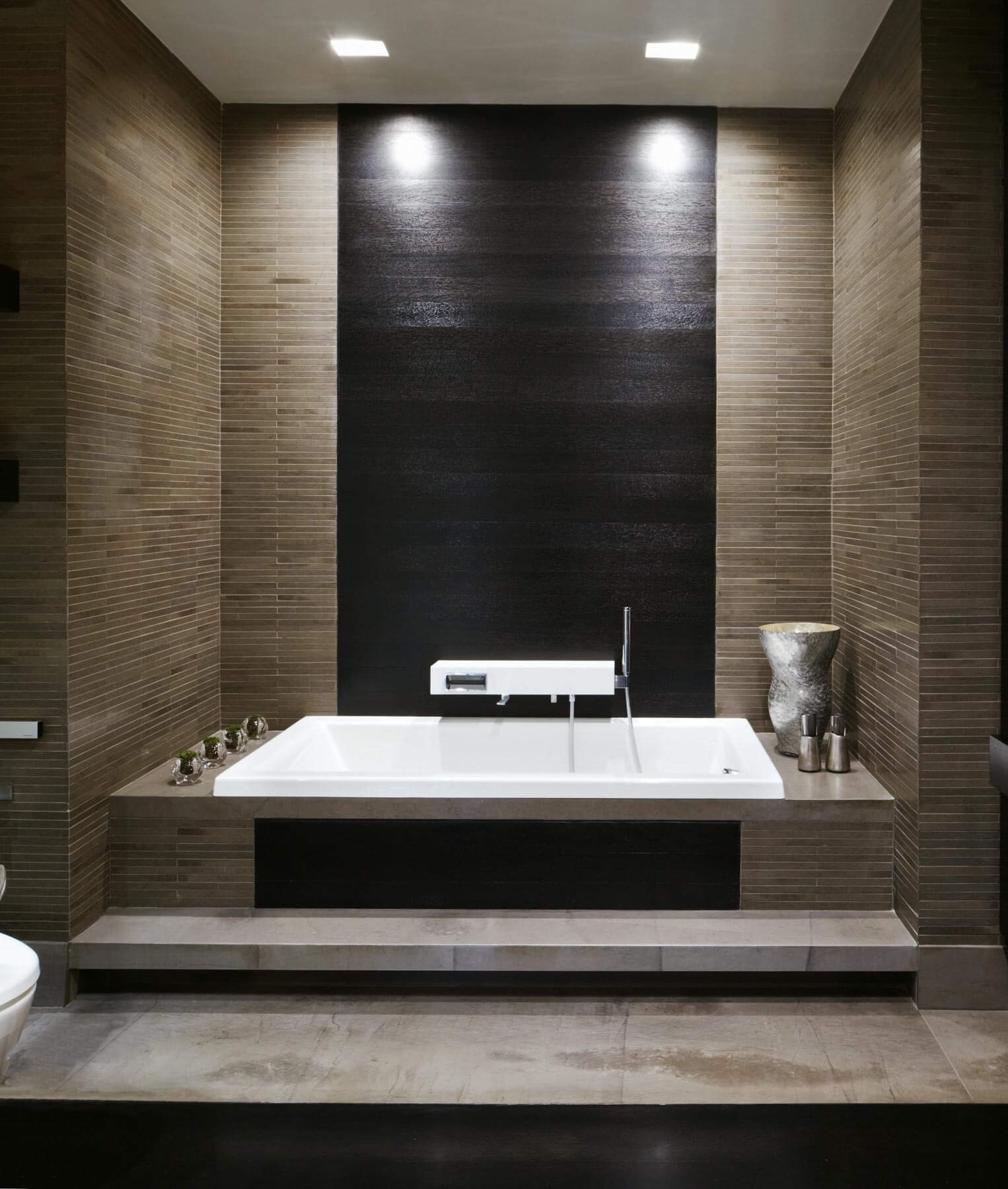
Private Home in New York City, USA
Use muted tones to emphasise peacefulness
When taking a DIY approach to bathroom design, it’s easy to go over-the-top in our approach toward colour. Of course, bold colours in the bathroom can be amazing, but they’re not conducive to designing a Kelly Hoppen inspired bathroom. A Hoppen bathroom will tend to select a maximum of three swatches from within each of which you can explore. A common combination will be a vital balance of light and dark tones to give us both an airy sense of lightness and a heavy sense of relaxation, highlighted with shimmering golden fixtures, fittings and ornamentation acting as a conduit and an axis between the two.
To find out more about Kelly Hoppen, her projects and her services, visit her website.
Looking for something else to read? Check out our interview with celebrated Californian interior product designers Kalon Studios.